Sunday, February 19, 2012

404 Error Page

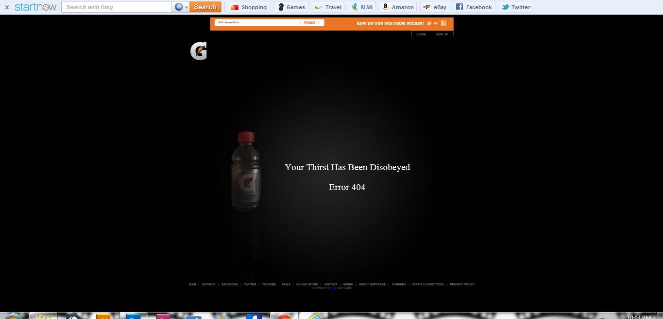
I have decided to do my 404 Error page with Gatorade. I have taken a couple of pictures of an empty Gatorade bottle to indicate that there is no more gatorade (the user has made an error). My tagline to indicate the user of making the mistake is "You Have Disobeyed Your Thirst", the opposite of the original tagline "Obey Your Thirst"


I ended up using this picture because it best signifies the feel of Gatorade.com

I TOOK THIS IMAGE INTO PHOTOSHOP. MASKED OUT THE BOTTLE AND ADDED A BACKGROUND GRADIENT AND A REFLECTIVE SHADOW!!


I have also taken screen shots of the logo, header, and footer to add them to my site for cohesiveness


I used the logo as to get the user back to the homepage


AND HERE'S THE FINAL PRODUCT!!


Thursday, February 16, 2012

3 Wire Frames

 my first wire frame is designed with a top header, with a exciting logo. A home bar with simple navigational buttons. Also, a scrolling pic of video that shows nba players interacting with children. Below that there are buttons for different summer camps (ex summer I or Summer II) and under that the following requirements to join those events. And at the bottom there is links for social networking sites and contact information.

Monday, February 13, 2012

3 Personas


The first persona is Dan Smith who wants to shoot like Ray Allen. He pursues his dreams and is very competitive in sports.

The primary persona is Paul Johnson because he is the ideal person who would sign his child up for summer camp. Due to Paul's busy schedule he would like something exciting and inspirational for his child to join. He also would like it to be easily accessible and affordable.

The last persona is John Murry, a little boy who has big dreams of becoming a member of the NBA. He heard about the summer camp from a friend and decided he wants to join. So John wants to convince his mother to sign him up this summer.

Thursday, February 9, 2012

Kansas City Kaws Event Website Objectives (Message and Emotions)


The objective for my website is to keep kids active over the summer in the Kansas City area, keeping their parents satisfied and and their kids out of trouble. I want the website to be inviting/exciting to kids and their parents from the surrounding community.  The event will be held locally at surrounding high school gymnasiums and community centers. I also want the website to feel exciting to the parents so they won't feel like their children aren't involved in proper sporting camps. My website should be easily accessible for the users to navigate, especially for the parents. I want it to quick and easy to sign up for, while still attaining the excitement. I also want all the links to be necessary ones for gathering information about the event, such as place, sign-up, and the price.  The emotion I want the website to have is motivating and exciting for both kids and their parents. I want the overall design of the website to be clean in order for easy navigation. I also want scrolling pictures of the players and children actively getting involved with each other from past events.

Wednesday, February 8, 2012

Event Website; Subject Matter

http://www.nba.com/caravan/

I chose this website because the subject matter pertains to my project. I love the clean look and it is easy to navigate. The message and emotion of the website is very inviting. Clear pictures of children actively involved with NBA players.

http://www.nba.com/jamsession/2012/index.html

I also chose this website because the subject matter is equivalent to my project. Exciting picture and graphics inviting fans to get involved with the NBA All-Start Weekend activities. The banner shows the dates. The categories are necessary ones, for instance schedule, tickets, and event parking info.

http://www.redbullairrace.com/cs/Satellite/en_air/Official-Red-Bull-Air-Race-Homepage/001238611393596?pageOrigin=RedBullUSA

I chose this website because it had nothing to do with my subject matter and i wanted to get a different user emotion and message to see what i could possibly add. I like this website because it gets your attention by using HD scrolling pics which involve action and excitement, but design wise it is very clean and simple to navigate